This is a case study about how a design system can save the day on an aggressive timeline
and change the way we design digital products.
I first read about atomic design a few hours after
Brad Frost tweeted the link to his original article back in 2013,
and I’ve loved it ever since. I’ve made several design systems inspired by this idea, but none
have been used as widely as the one that I helped develop for the
CMMI Institute.
The Problem
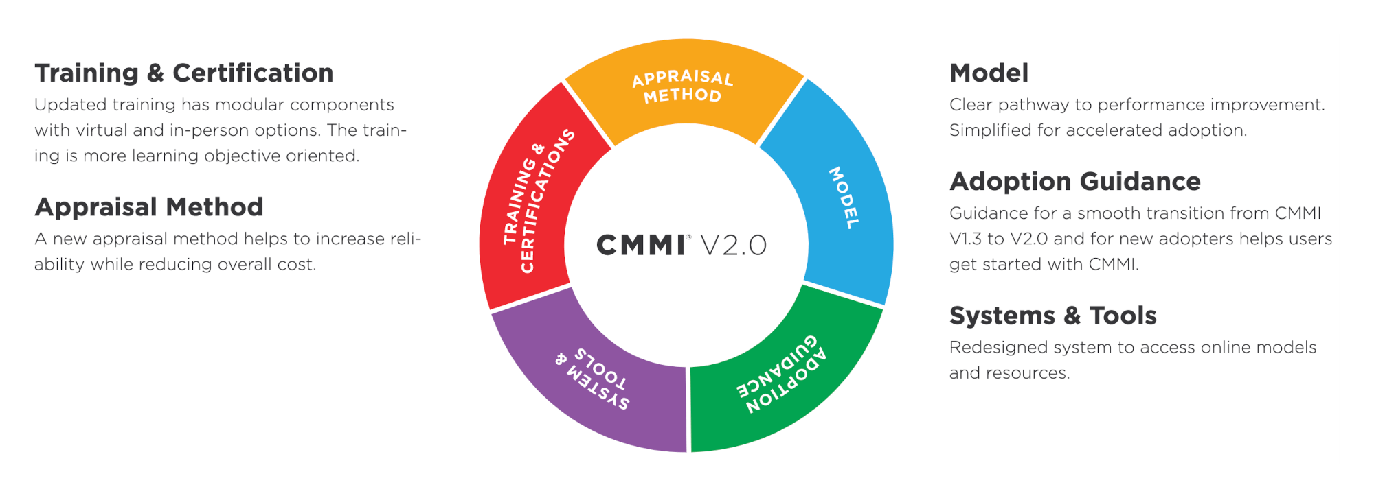
This interactive diagram explaining the components of CMMI V2.0 was one of several complex JavaScript
components that the new site had to include at launch.
The CMMI Institute was launching a new version of their flagship product, the CMMI, and they wanted to present a
new, redesigned website to go along with it. I was part of a two-person UX team. I contributed research, analysis,
and design, but it was my colleague who developed most of the wireframes and mockups, while I took responsibility
for making sure that those designs were ready for our developers to use.
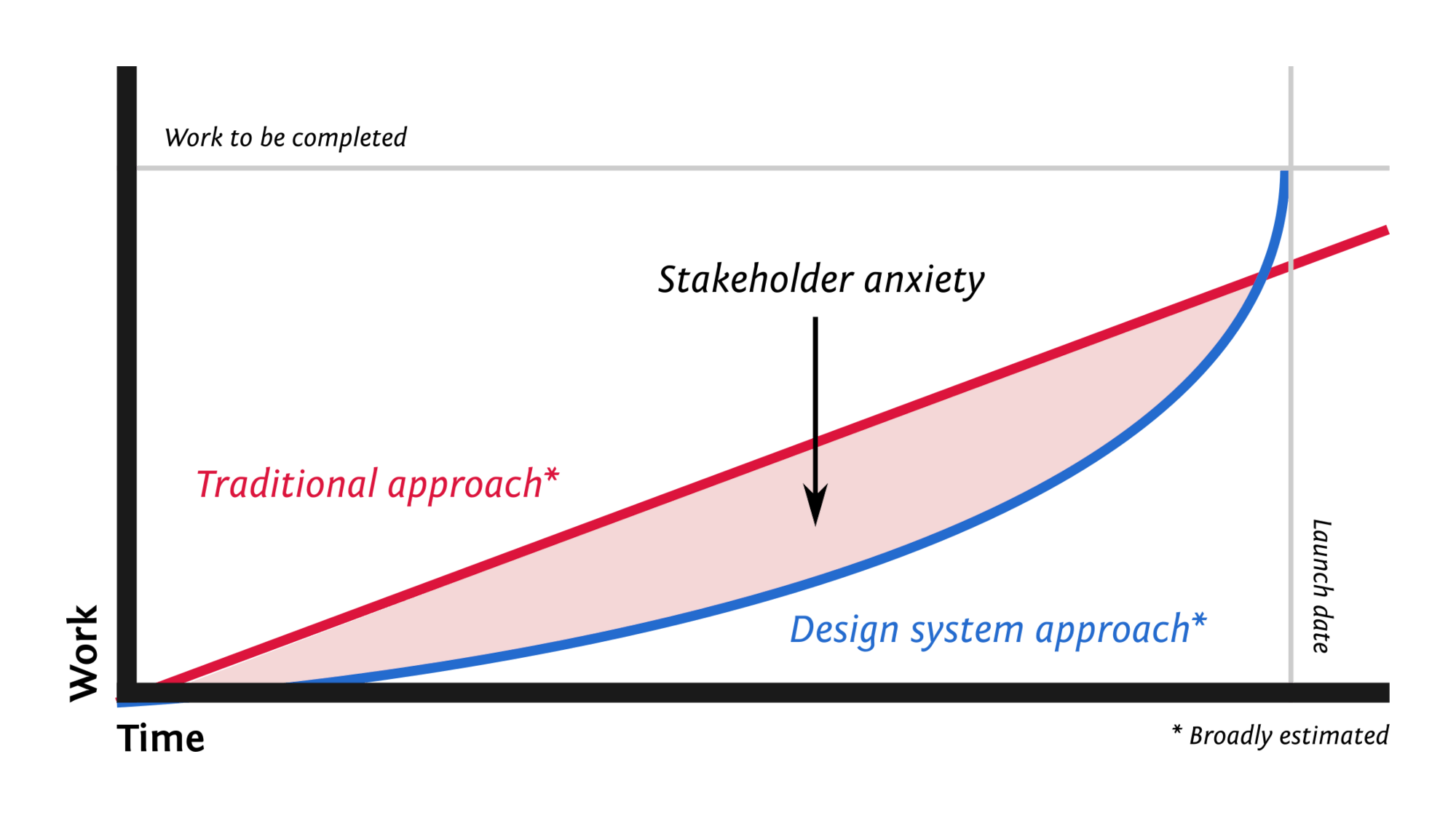
We knew our exponential growth curve would lag behind a more traditional approach throughout most of
the process, and that we’d have to deal carefully with stakeholders’ growing anxiety over
that gap.
The timeline for the new website was aggressive, and it seemed clear from the start that while linear progression
would show regular progress that stakeholders would more easily understand, it would not suffice to reach our
deadline. Atomic design often creates an exponential progression: progress initially seems quite slow, but then
takes off as you reach the point where you can build more complex components simply by combining existing, simpler
ones. The risk of this approach was worrying stakeholders, as our progress throughout the project would lag behind
what they might expect from a more traditional linear progression until the very end. The exponential growth we
expected also raised the risk that if we were off even in small ways, we might miss our deadline anyway. The design
system gave us our best chance of making the deadline, though, so we took that risk.
My Approach
My colleague provided me with a steady input of wireframes and mockups, which I broke down into their constituent
components. I started with the simplest possible components, like links and buttons, and built up to larger and
more complex components, like cards and even complex, interactive content pieces.
A collection of components by itself would only be a component library, though. We made it a design
system by combining it with documentation of design guidelines and decisions. We had sections that covered
our rules for typography, iconography, colors, and so on, while each component came with guidelines about when
and where it should be used, how it should be used, and how it should not be used.
Another example of a complex, interactive content piece. On the left is how the content is rendered
without JavaScript; on the right, how it is enhanced when JavaScript loads successfully.
I have long been an evangelist for progressive enhancement — serving a simple core that works for everyone,
and seeing everything from styling to images to client-side behavior as enhancements that some users may experience.
This provides an experience that always works, and usually works really well, as opposed to the alternative of just
reporting errors. Each component began with the most concise, semantic, accessible HTML markup I could write. I
then wrote CSS (well, technically, I wrote Sass) to style it. For most components, that was sufficient, but a few
called for something a little more than that, in which case I would write
unobtrusive JavaScript. By designing
first for the base experience without JavaScript and treating client-side behavior as an enhancement, we ensured
that every component would always work. In fact, four months after our initial release, one of our testers found a
critical bug in our JavaScript that had kept any of it from working in an older version of Internet Explorer.
We’d never received any complaints, though, because everything still worked, and none of the users who’d
experienced the bug had even noticed anything was missing.
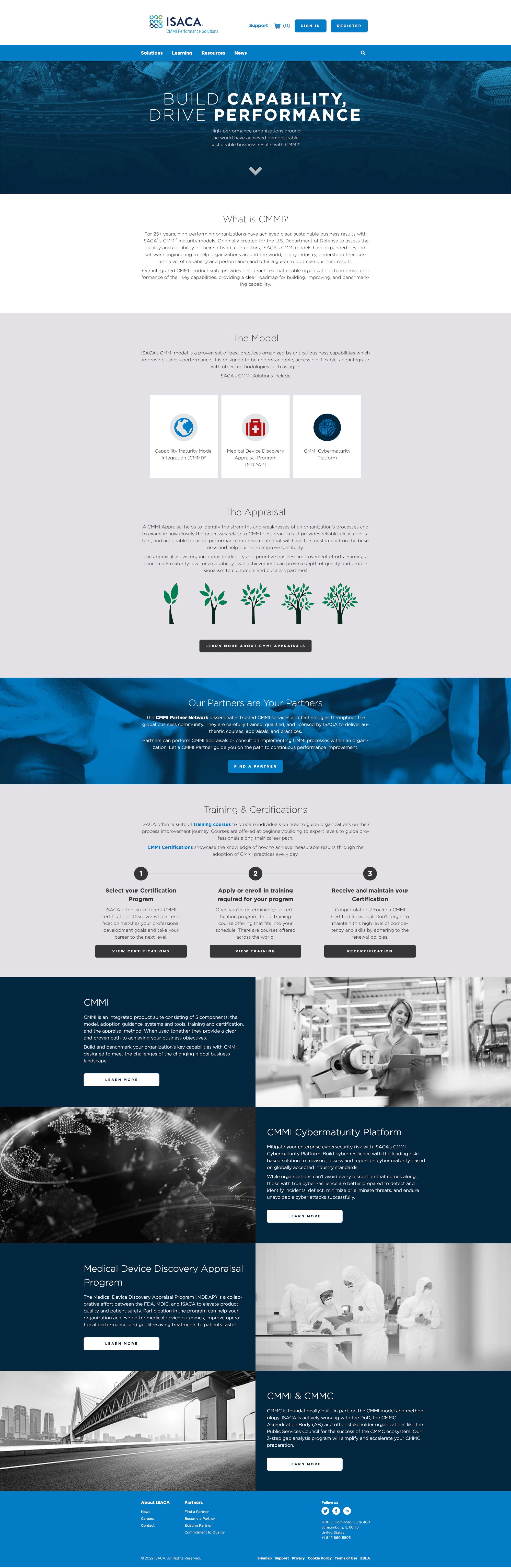
The ISACA CMMI homepage is built using the CMMI Institute Design System.
Our Solution
As expected, this approach caused no small amount of anxiety among our stakeholders, who were dismayed by how
little visible progress we made as the deadline grew closer and closer. If I was taking so long to create such
small components, they wondered, how would I ever complete the large, complex pieces in time? Of course, the answer
was that I would do it by taking so long on small, simple components. The biggest, most complex components
necessarily came last, as they were made from the greatest number of small components. These components garner the
most attention, but that doesn’t necessarily mean that they must take the most time. By the end, they were
astonished that I was able to suddenly produce what seemed like half the system in the last weeks of the
project — and end up delivering it all on time.
Once the website was launched, we used the design system for a number of other products that followed. The CMMI
Institute worked with a network of partners. I recommended making the design system public so that those partners
could use it to make a more direct visual connection to our brand, associating themselves more closely with us
while providing a more consistent, branded experience across our myriad partners. Though received warmly, this idea
was never prioritized for action, and now seems unlikely to happen.
What We Learned
I was not the only one under pressure from this aggressive timeline. My colleague was likewise under pressure to
produce mockups as quickly as possible. The design system proved to be an incredibly valuable mechanism for
catching issues, though. Mockups move the designers’ focus to the page, which can make it difficult to design
systematically. For example, my colleague provided me with mockups that included three different styles for lists
that provided for significant chunks of text in each item. Had I been implementing templates, I might have also
been in such a rush that I didn’t notice, but having to categorize these into a design system prompted
discussions about what distinguished them functionally and when to use one instead of another. It helped us to
reorient our focus from “what looks good on this page” to “what is the intent that we’re
trying to render?”
My work on this design system helped me develop a method that I call “system-driven design,” in
parallel to “test-driven development” in programming. When programmers write code and then write unit
tests to test that code, there are frequently gaps in the testing. In test-driven development, you start by writing
tests. When you have a test that fails, you can then write just enough code to make the test pass, and no more.
Then you go back to writing tests. This ensures that you have a robust, reliable test suite. In system-driven
design, the design system is like our test suite. We don’t start with mockups, but with components in our
design system. When we face a design problem, we think about it in terms of the overall system, rather than jumping
straight to a mockup of the page. Can we solve this problem with an existing component? Do we need a new component?
Do we just need to expand the use case of an existing component? What sort of system would we need so this is no
longer a problem? Then we make the changes necessary to the design system to make that happen and, rather than
delivering a mockup, we deliver a working prototype that requires no greater investment of time, resources, or effort.